During my time at Happybase, I was responsible for a broad range of creative tasks, including video editing, animation for explainer videos, illustration, English voice-over work, and graphic design.
My primary focus was on editing and reworking existing video content to make it more engaging and better aligned with the brand identity.Because many of the exercises are meditative in nature, audio quality played a crucial role. I refined the sound design to strike a balance between engagement and calm, ensuring the audio supported the exercises without becoming distracting.
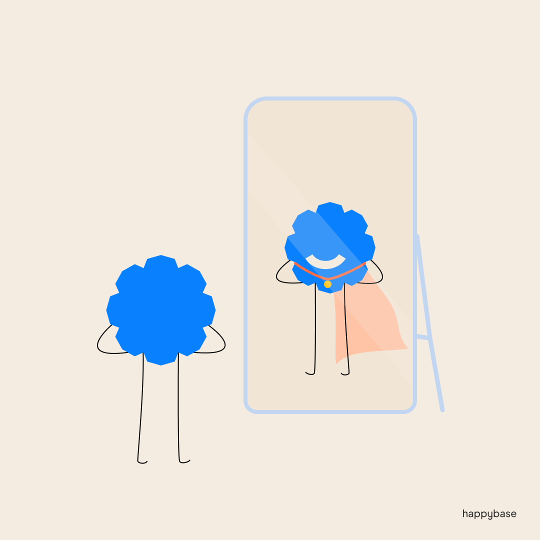
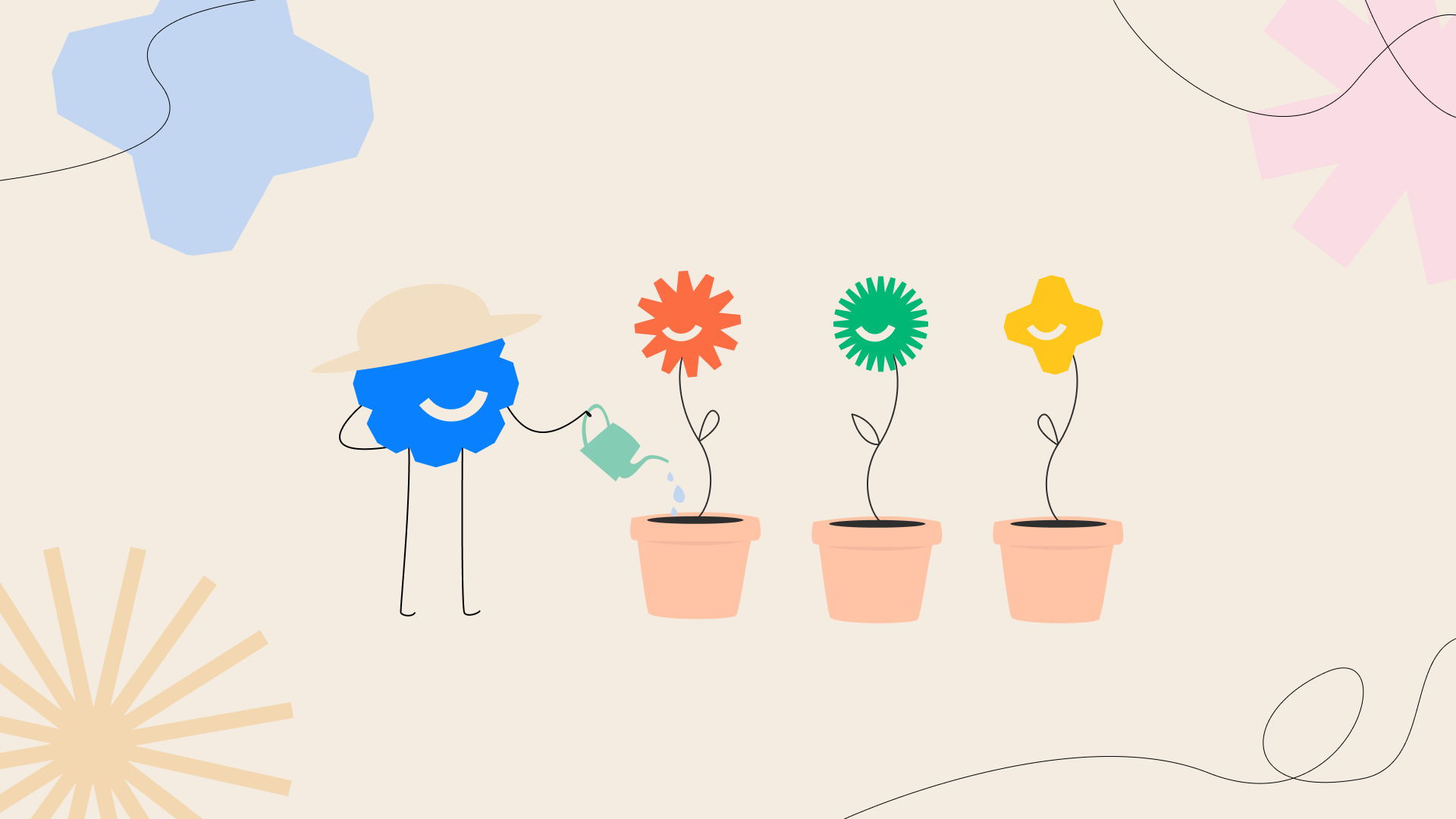
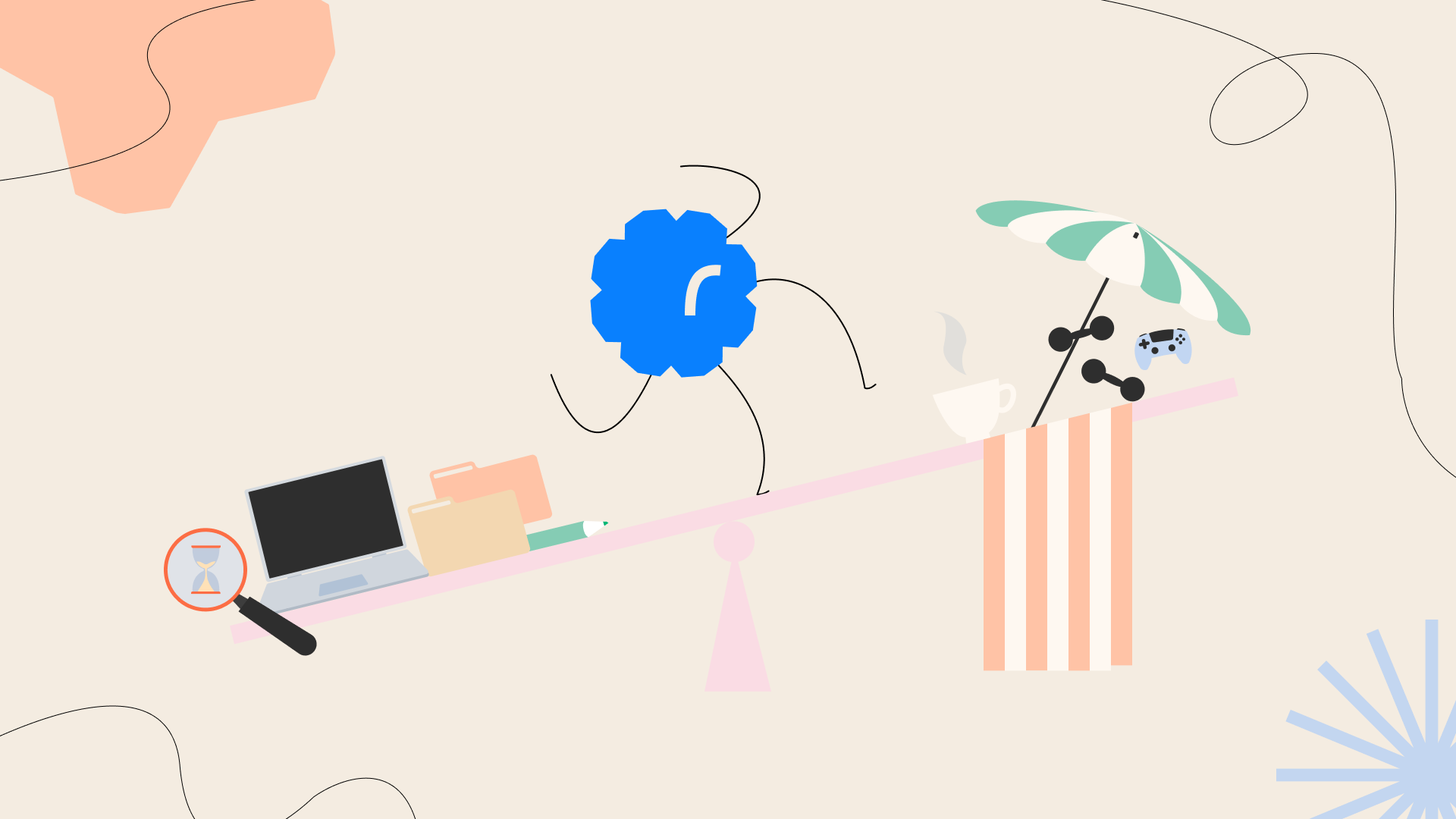
In addition to video and audio work, we developed the Happybase logo, named Happy, into a character used to communicate the core ideas of the methodology, particularly for marketing. I was responsible for creating the still illustrations of Happy, translating abstract themes, challenges, and solutions into clear and approachable visuals.
Alongside the branding improvements, the platform itself required refinement. I worked closely with the creator of the methodology to improve the website’s user experience. Many exercises were difficult to discover and relied heavily on email prompts. Through customer journeys, interviews, and user research, we restructured the content into a course-based flow, making it easier for users to navigate exercises tailored to their specific needs or to prepare for conversations with their manager.
One of the most valuable aspects of this role was the creative freedom I was given. I was encouraged to experiment with new tools, expand my skill set, and take initiative. This environment allowed me to refine my design process and develop a stronger understanding of how visual communication can support mental wellbeing and user engagement.
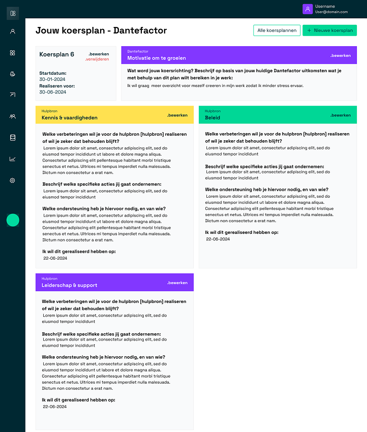
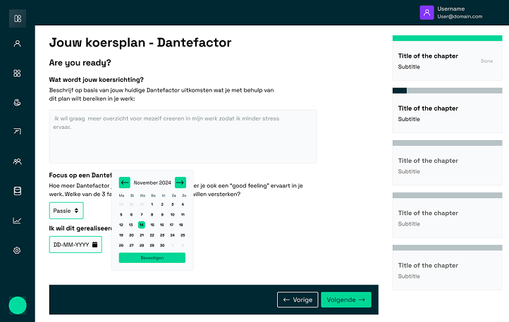
For Yucap I did the complete UI side of the project and helped the UX Designer realise their ideas. Yucap is a website where employees at a company can evaluate what they what they want to achieve and add deadlines to those achievements to stimulate them witht he use of the Dantefactor. It is currently an ongoing project so some of the content is not there yet.
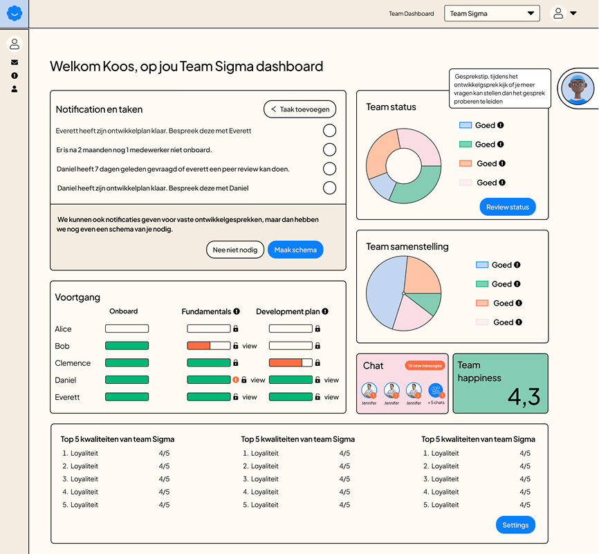
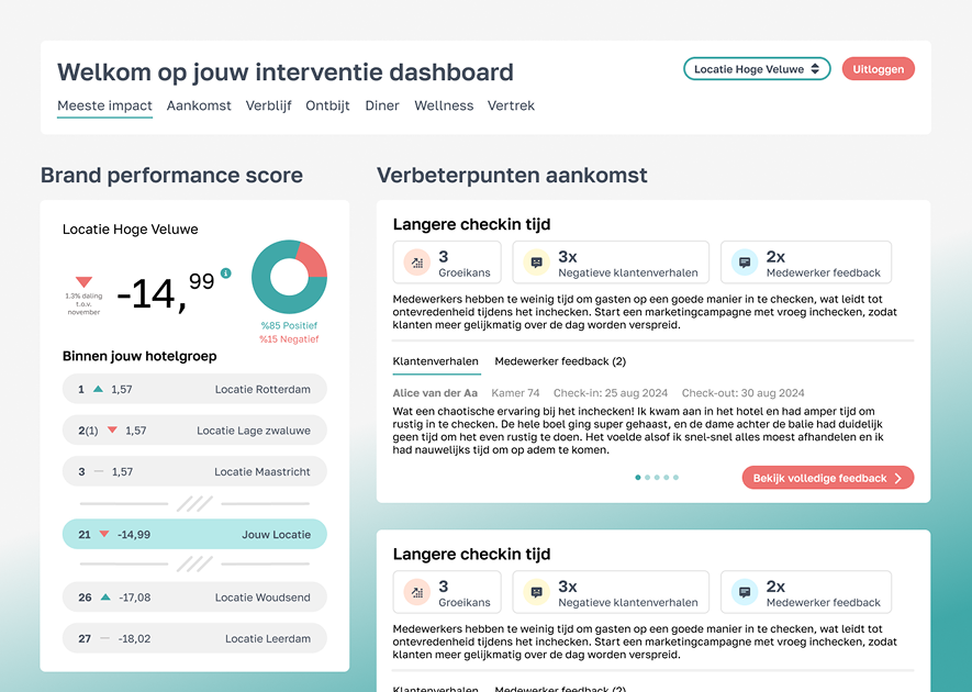
The image above is a dashboard design I made for Happybase. Funnily enough I also work at Happybase as a Digital Designer and Video Editor. I was asked to make their dashboard since I’m already familiar with their branding and style. The image on the left is a design I made for Amplix's for a dashboard to keep track of feedback from customers from recreational facilities. Both are ongoing projects.
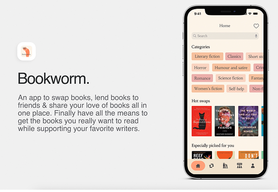
For my thesis project, I aimed to address the challenges faced by the ebook industry. The digital publishing landscape has stagnated, offering readers far fewer capabilities compared to physical books. My goal was to develop a product that restores the same level of freedom and versatility that physical books provide, while ensuring that writers and publishers are fairly compensated.
The question I wanted to ask was:
“How can an ebook application incorporate the sharing and swapping of ePUBs for readers while taking the interest of the publishers into account?"
Target audience:
Digital and physical readersReaders of all agesReaders looking to socialize with others on a specified platformThe ability to read more books they like/love without breaking bank
My research was mostly about the publishing world and how the music world could help the publish world forward. In my product biography You can see all my research and how my product solved the problem.
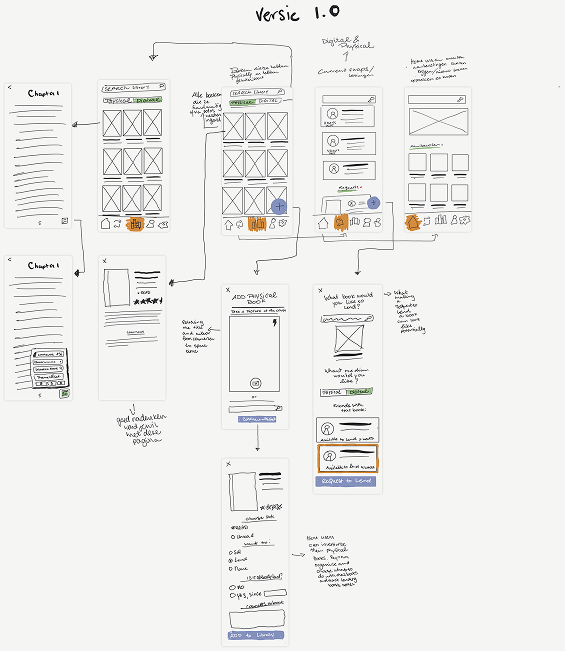
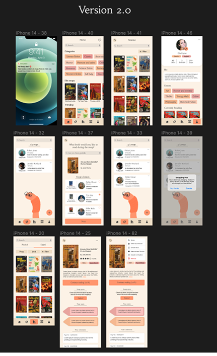
During this project, we underwent multiple versions and iterations, which proved crucial in refining our ideas and solutions. Creating numerous wireframes greatly aided in clarifying my vision and identifying effective approaches. This iterative process has become a vital step in my own methodology, a valuable lesson learned through this experience. I'm proud to have completed my studies with this project, achieving a score of 8.
The Problem:
- People can’t exchange or sell their ebooks like physical books.
- Can’t lend out ebooks without sending them the full book file.
- No real ownership
The Solution:
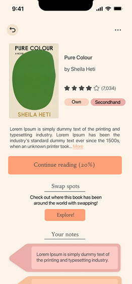
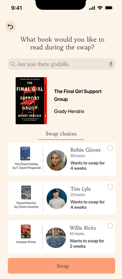
- Book swapping, you look for a book and get matched with someone that would like a book in your library to read. You each get 2 weeks to read it.
The books you lent disappear from your library and return when the time is up
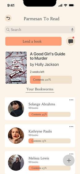
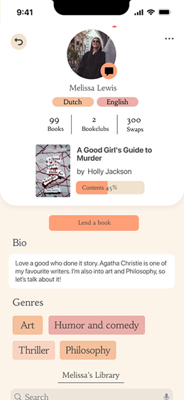
- Forming bookclubs online and being able to see how far other members are and they can add commentary along the way that you all can see.
- Selling ebooks secondhand, you can sell books you don’t wanna keep anymore to make room in your library and get some money back. A small percentage goes to the writer/publishers.
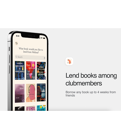
Some of the features include the ability to trade ebooks with others online, donate directly to writers, recycle old ebooks, join an online book club, and lend books within the book club.
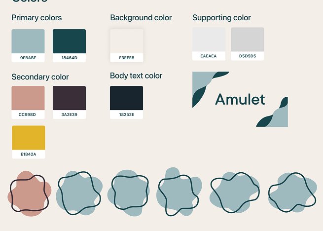
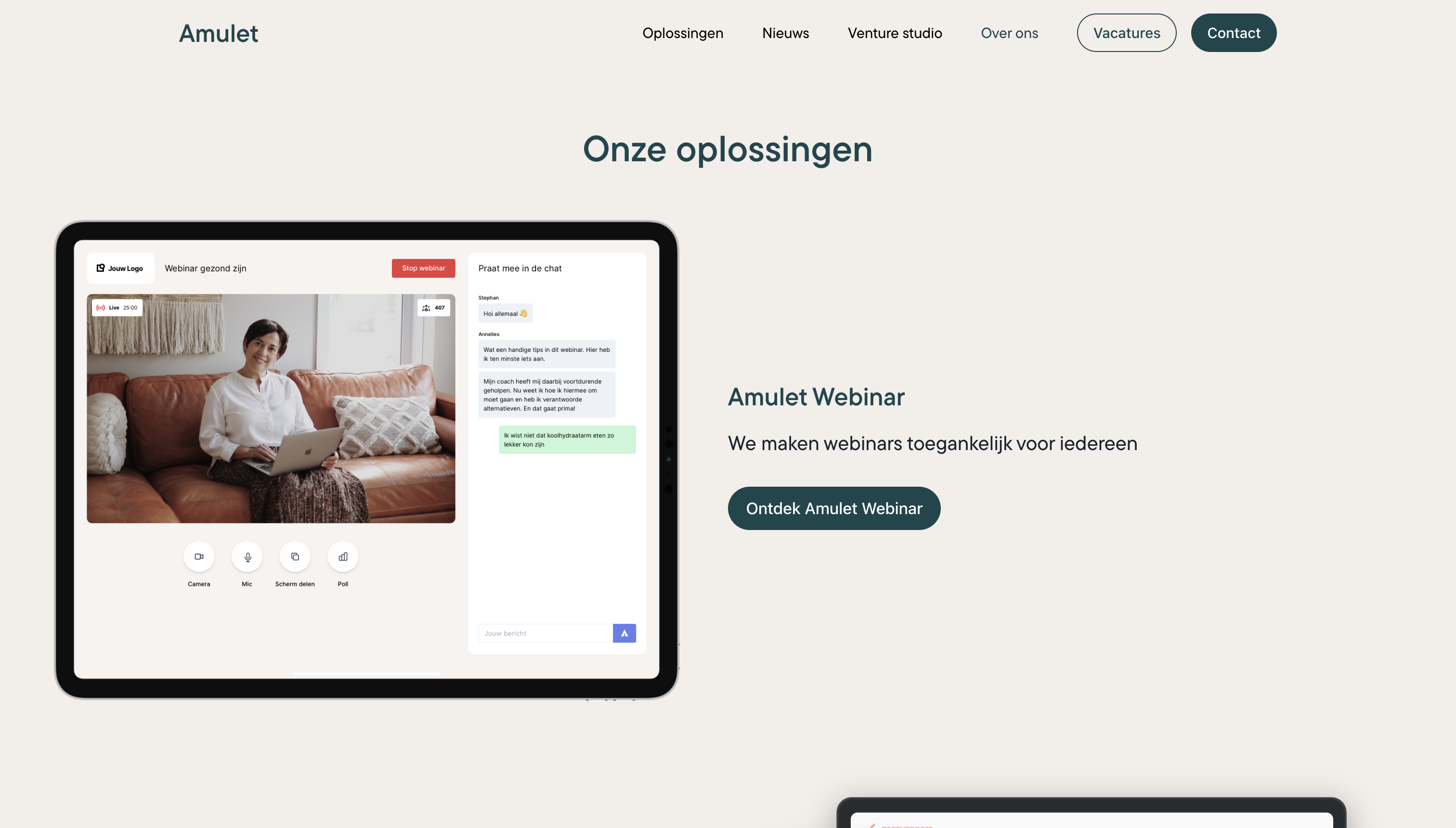
One of my first projects at IGNE was developing a new brand identity for Amulet, a company that creates technological solutions for healthcare. Inspired by the symbolic meaning of an amulet, protection, trust, and reassurance, the branding needed to feel calm and supportive.
I began with extensive color research, focusing on the use of amulets and visual trends within the healthcare sector. Amulet’s existing style guide was very limited, using only two colors and textured gradients, which did not scale well across presentations, documentation, or printed materials for expos.
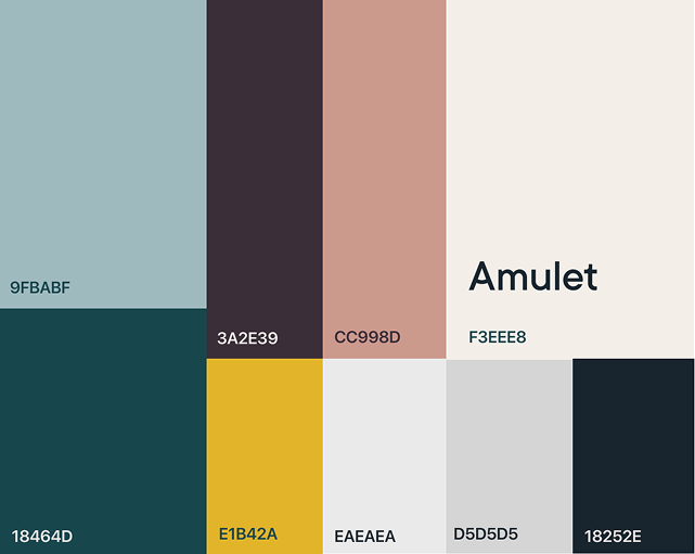
The original red and orange palette felt too aggressive for a healthcare context. I introduced a primary color that blends green with subtle blue undertones to communicate calm, trust, and balance without leaning too heavily into a natural aesthetic.
The secondary red was refined into a deeper burgundy tone to retain a sense of passion and depth while softening its impact.In addition to the color system, I designed new visual elements for documentation and expo materials.
Flowing, organic shapes were introduced to represent flexibility, adaptability, and innovative thinking, reinforcing the company’s focus on modern, user centered healthcare solutions.The visual identity I developed is still in use today across Amulet’s website and event materials.