Happybase Redesign

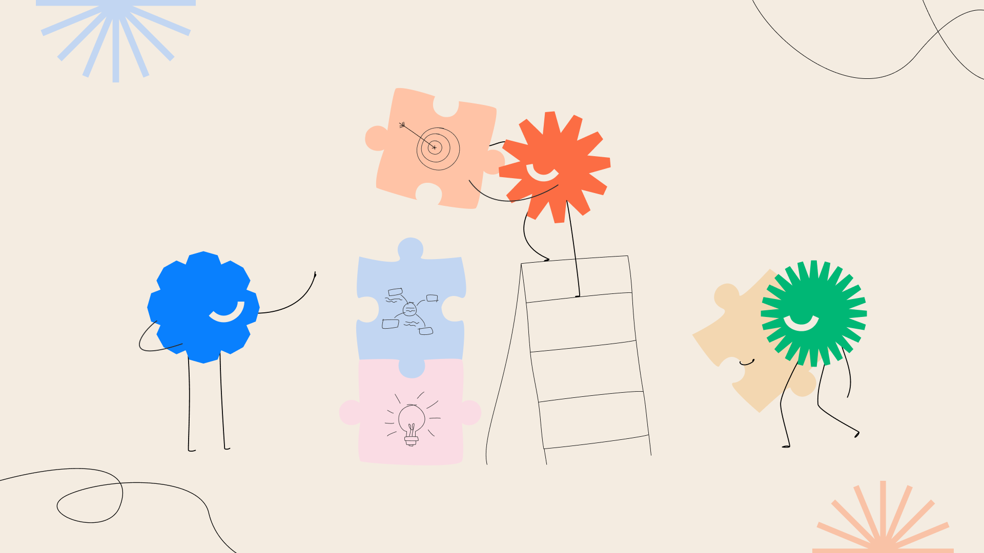
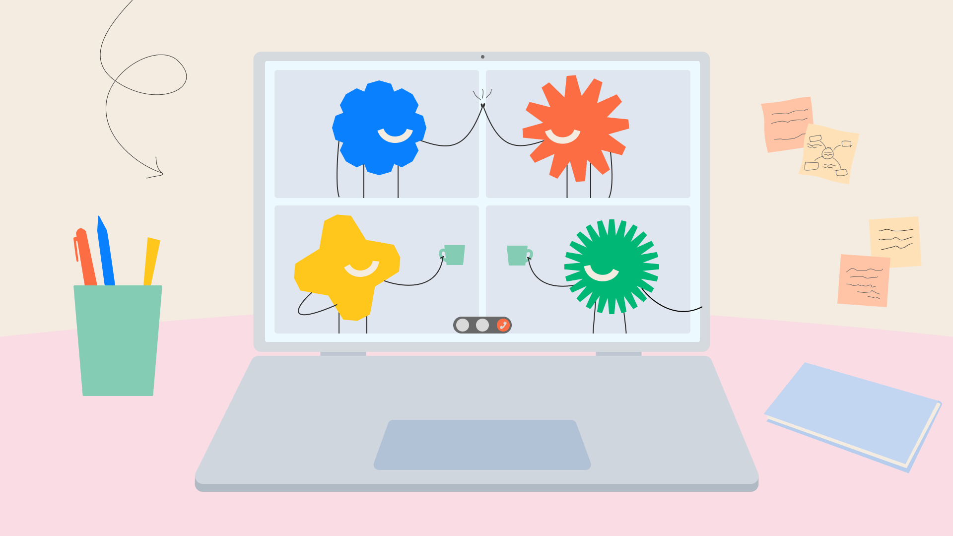
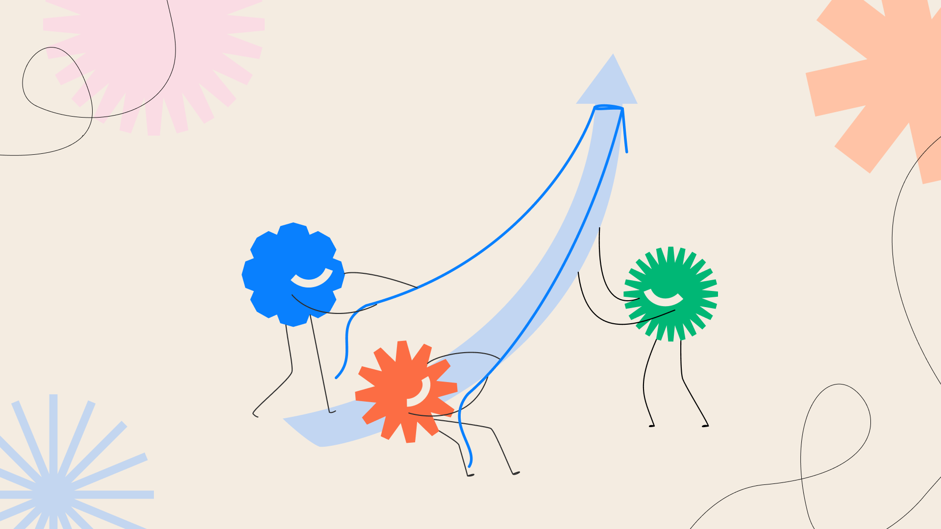
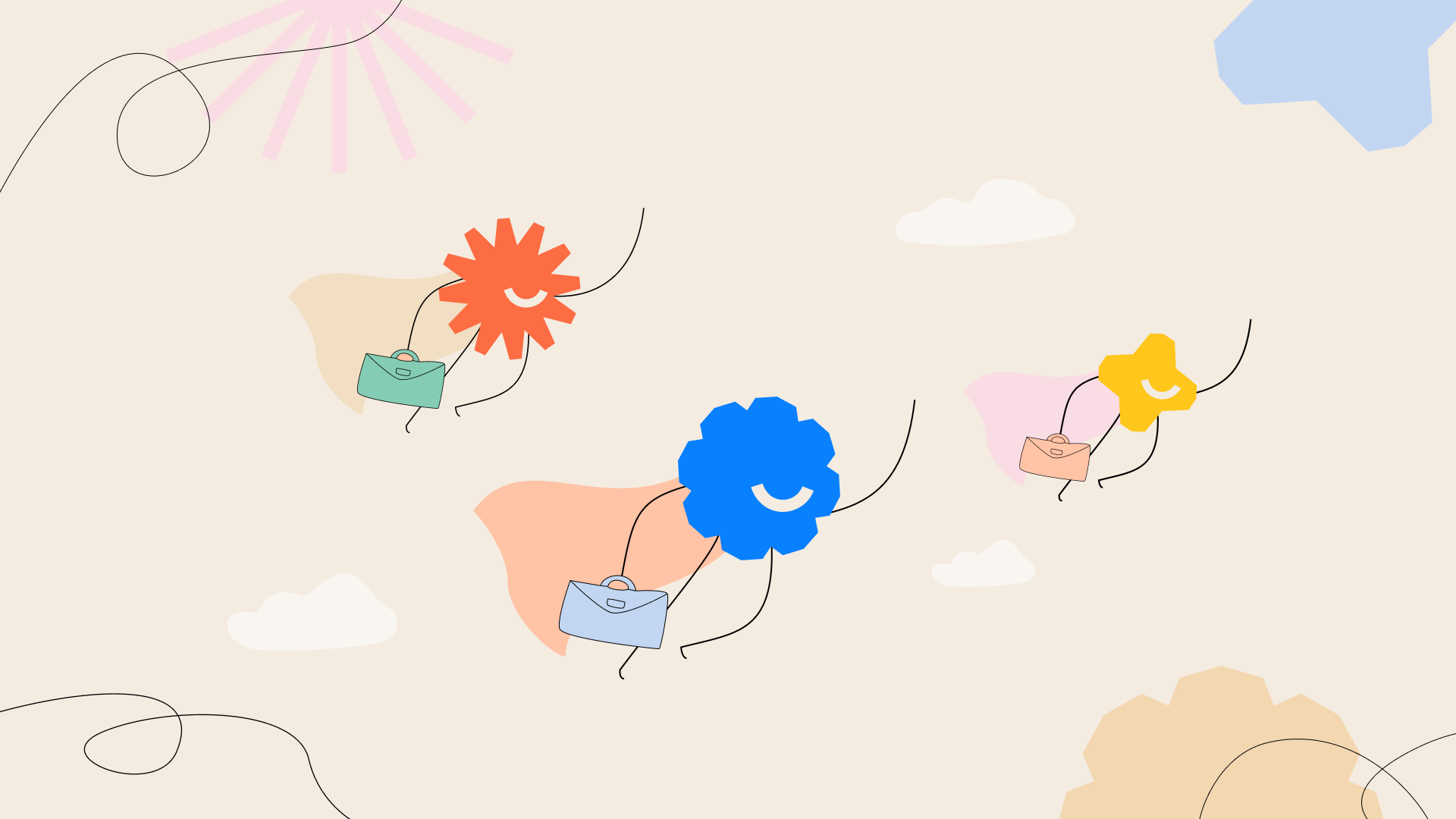
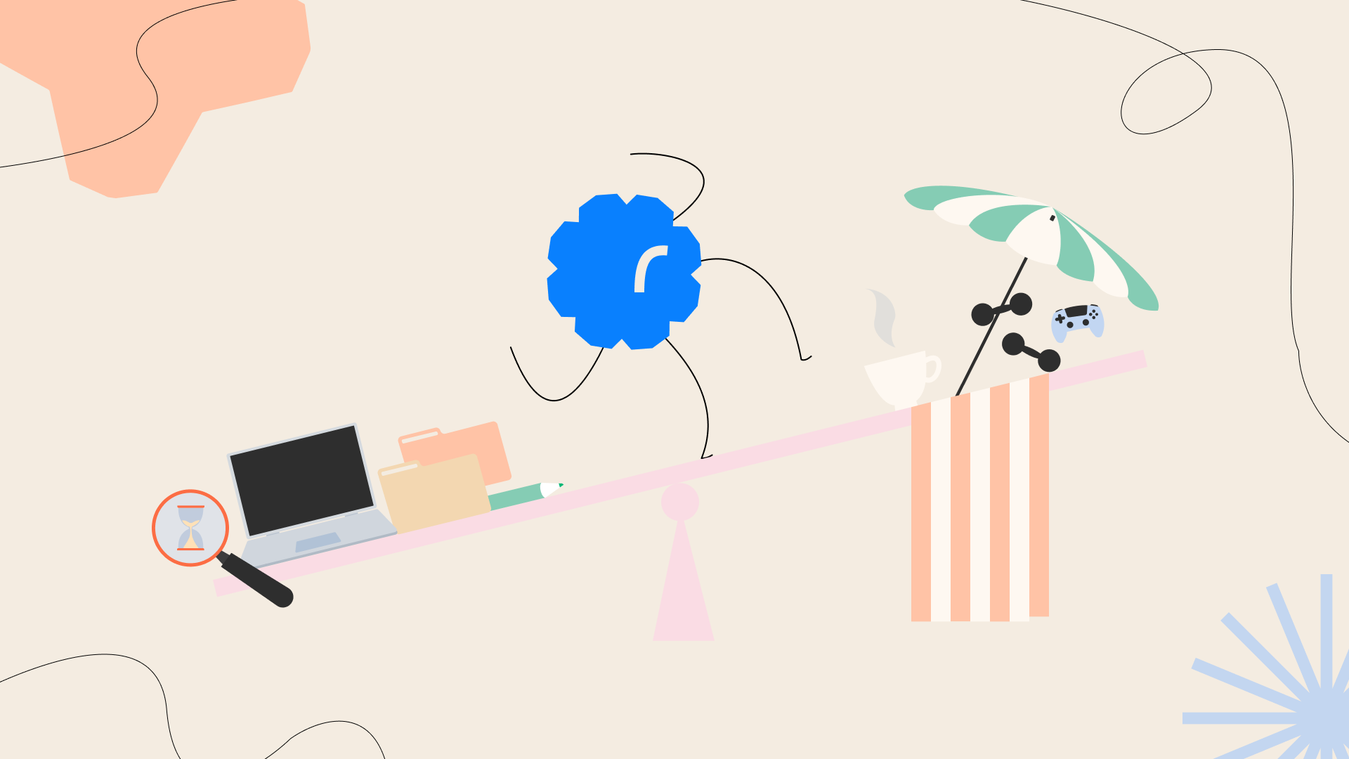
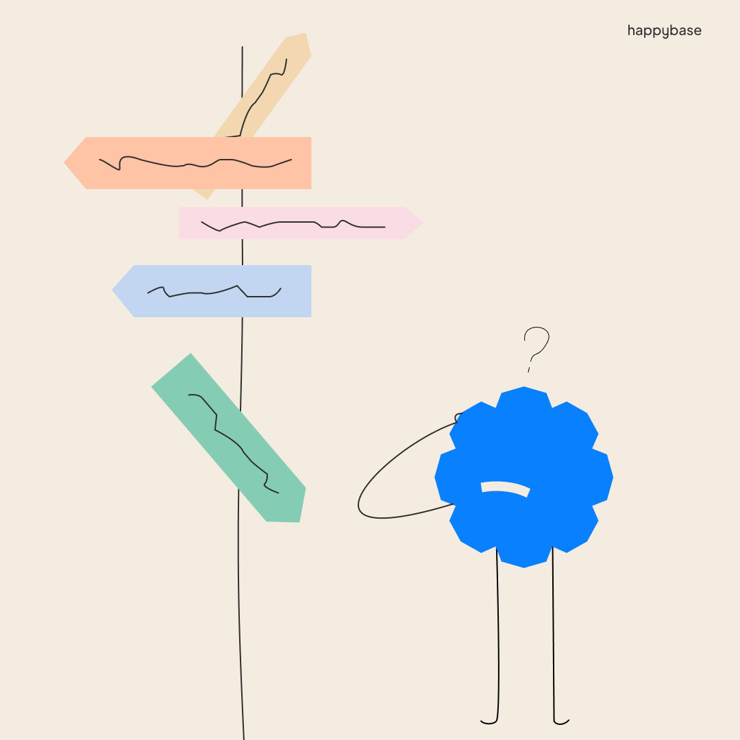
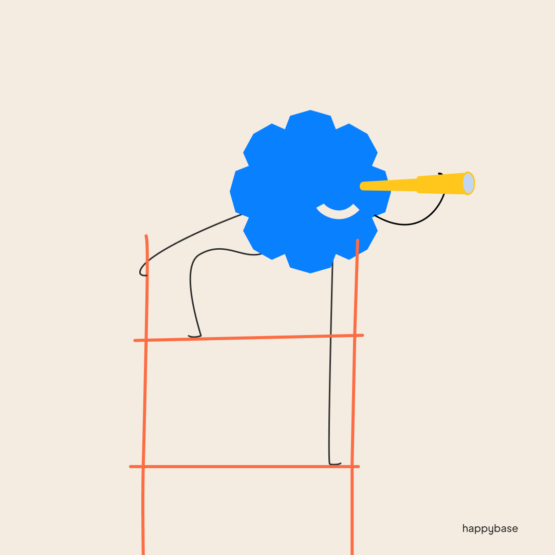
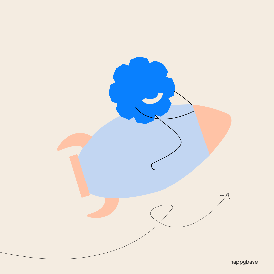
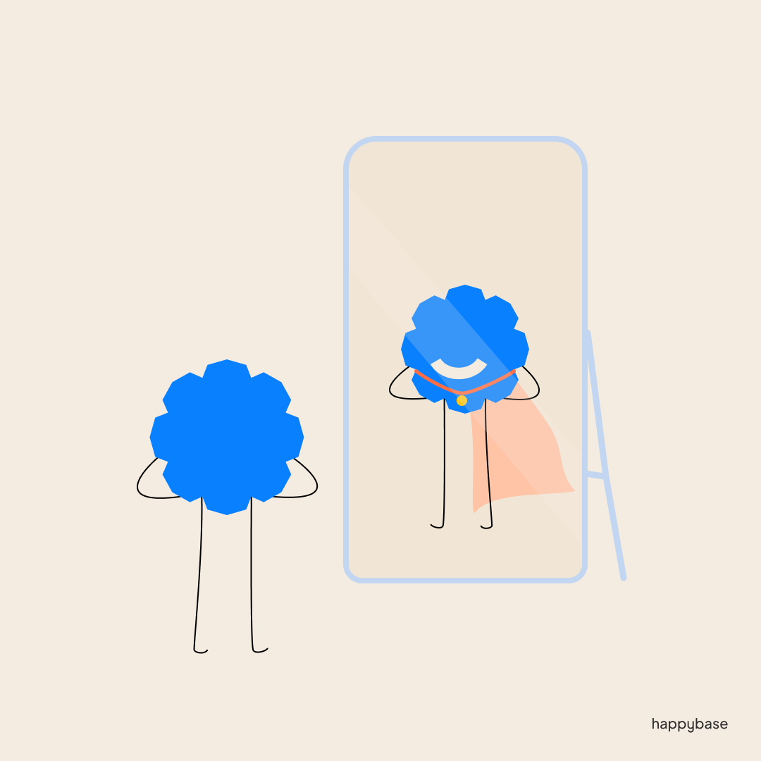
With Happybase getting an updated platform they also wanted a branding refresh. With this refresh we added a new character, Happy. He would be used to convey various issues people would have in their development. I was in charge of giving this character in all the static images for socials, the website and any other way we would display them.
I made it so that all of the marketing team could make their own happy in the future with a set of rules to follow. There are also other side characters based on the Happybase shapes if they needed any team or managers for their content.
New branding OJO, Ontwerp je Ontwikkeling


After working for Happybase, one of the Co-owners approached me to help them with a new project they where working on. They wanted new branding and a complete redesign of the old exercises that used to be in the Happybase style. Their Project had a lot of mindmaps and grapghs, so i intigraded that in the Logo. I wanted to make something that seemed like it could transform and mold itself into something else. Since this project was about coaching and working on your progress, I needed something could convey change. The company is called Ontwerp je Ontwikkeling, so I took the first letter of each word and made a face.
They wanted it to feel fresh and calm, with handdrawn elements. They wanted the blue purple main color, so I created a color pallete to reflect that with colors in spring and instead of black, I added a nice deep brown.
New branding for Amulet,
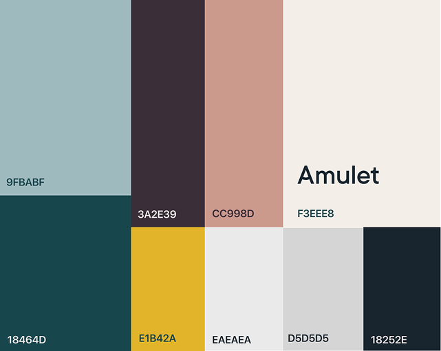
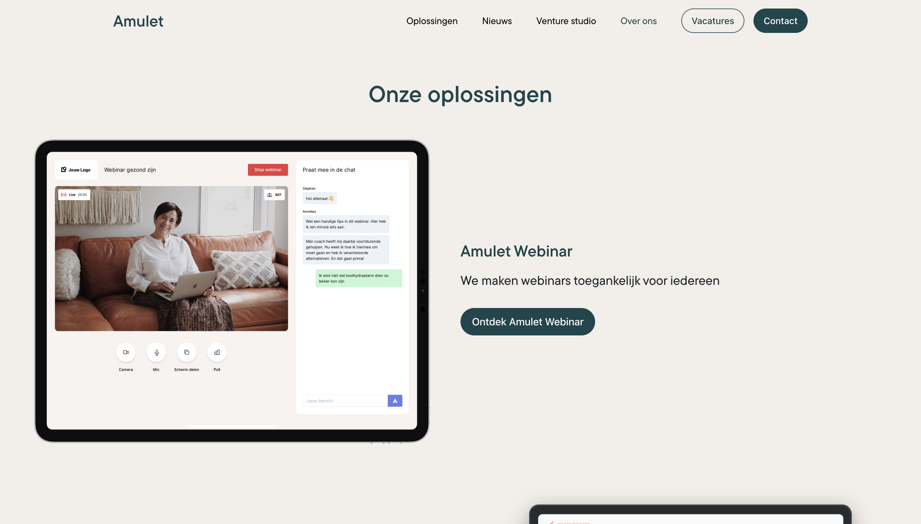
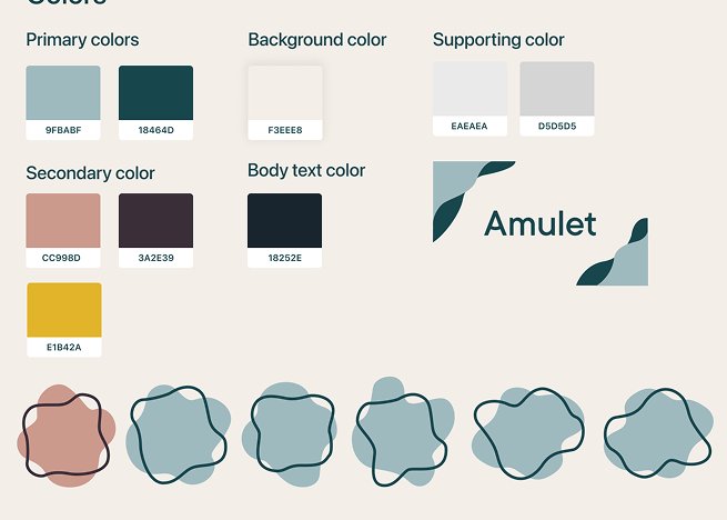
One of my first projects at IGNE was developing a new brand identity for Amulet, a company that creates technological solutions for healthcare. Inspired by the symbolic meaning of an amulet, protection, trust, and reassurance, the branding needed to feel calm and supportive.
I began with extensive color research, focusing on the use of amulets and visual trends within the healthcare sector. Amulet’s existing style guide was very limited, using only two colors and textured gradients, which did not scale well across presentations, documentation, or printed materials for expos.
The original red and orange palette felt too aggressive for a healthcare context. I introduced a primary color that blends green with subtle blue undertones to communicate calm, trust, and balance without leaning too heavily into a natural aesthetic.
The secondary red was refined into a deeper burgundy tone to retain a sense of passion and depth while softening its impact.In addition to the color system, I designed new visual elements for documentation and expo materials.
Flowing, organic shapes were introduced to represent flexibility, adaptability, and innovative thinking, reinforcing the company’s focus on modern, user centered healthcare solutions.The visual identity I developed is still in use today across Amulet’s website and event materials.